UI / UX Design
Booking "Travel.int" - E-commerce
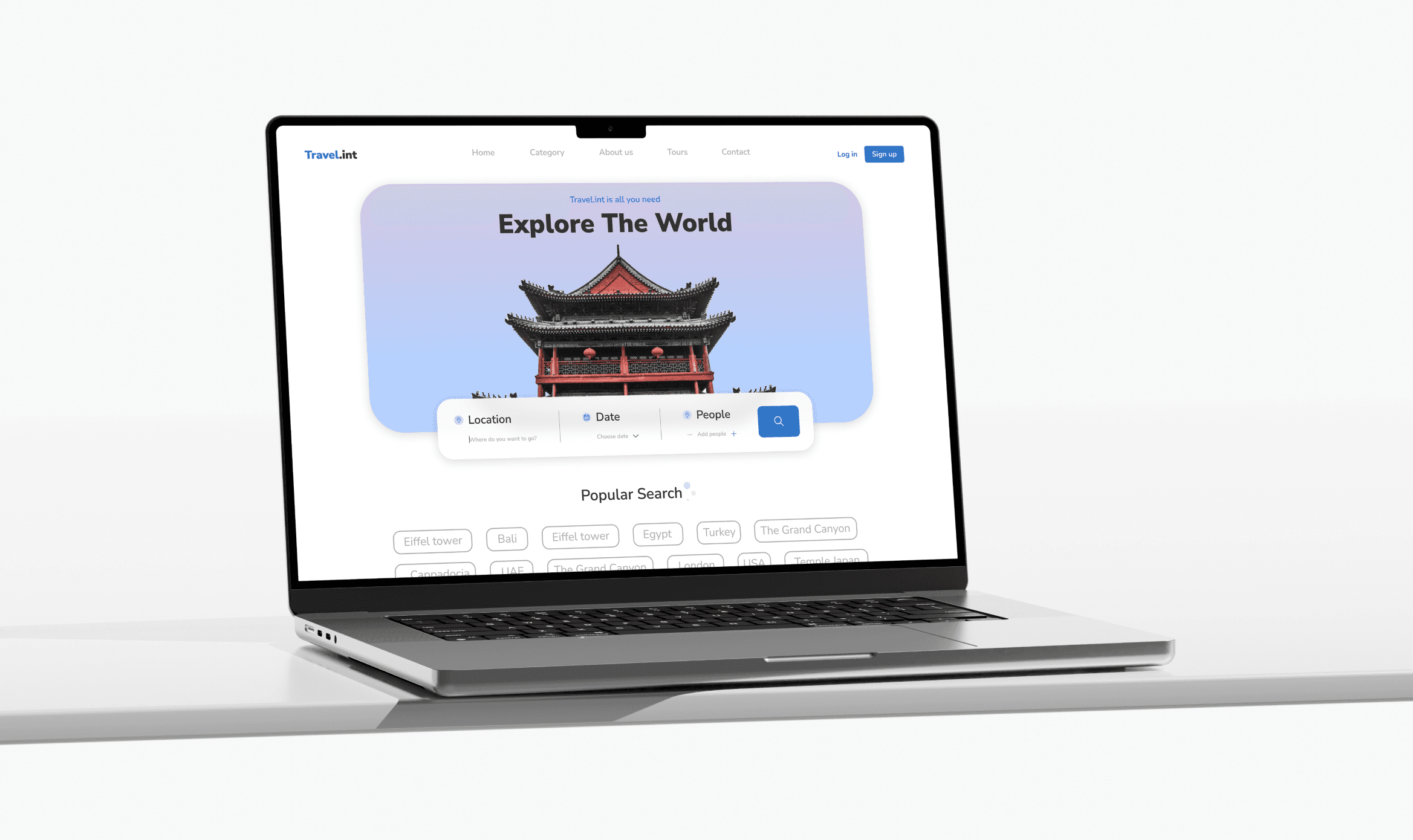
Designed the “Travel.int” web platform to boost conversions. Focused on simplifying user flow, enhancing emotional engagement, and building visual trust.
Year :
2023
Industry :
Booking, E-commerce
Client :
Travel.int
Project Duration :
11 weeks
Problem :
User behavior analysis revealed low engagement rates and a high drop-off during the search and booking stages. The homepage failed to evoke emotional connection or encourage exploration — most visitors left the site before interacting with core features. Complex navigation and visually overloaded layouts created a fragmented user experience, making it difficult to maintain attention and guide users toward conversion. The absence of a clear visual hierarchy led to confusion, as essential elements like search, categories, and offers competed for visibility.
Lack of trust signals and visual consistency further weakened conversion performance. Users hesitated to proceed with bookings due to an unclear structure and lack of immediate feedback. Analytics showed that the destination discovery process required too much effort and lacked the sense of ease and inspiration expected from a travel platform. The overall interface appeared static and outdated, failing to meet the expectations of a younger, design-aware audience. The core issue lay in the missing harmony between emotion, usability, and conversion — a gap that prevented users from feeling confident, inspired, and motivated to take action.

Solution :
To address these issues, I designed a visually clean and emotionally engaging web experience focused on simplicity and conversion. The new interface uses a lightweight hero search component that allows users to choose location, date, and number of people in one intuitive step. A bright, minimal layout with soft shadows and high-quality imagery creates a sense of openness and trust while emphasizing destinations over UI elements. The horizontal card layout in the category section supports quick exploration and reflects modern browsing behavior. To bridge the web and mobile ecosystems, I introduced a QR discount section that rewards engagement and drives app adoption, turning a simple scan into a meaningful conversion point. Consistent typography, color, and spacing across all screens ensured a unified visual identity, reinforcing Travel.int’s reliability and modernity while maintaining a sense of lightness and inspiration throughout the experience.


Challenge :
The main challenge was achieving balance — keeping the interface minimalist yet emotionally rich. Initial prototypes felt too sterile, so I integrated subtle gradients, soft animations, and warm imagery to add energy without visual noise. Another major difficulty was optimizing conversion without compromising user flow; usability testing revealed hesitation at key steps, which I addressed through clearer feedback and reduced cognitive friction. Maintaining cross-device consistency was equally demanding: the design had to scale seamlessly across desktop and mobile while preserving brand cohesion. Incorporating the QR feature presented a visual challenge, as it needed to stand out without disrupting the clean aesthetic; strategic spacing and contrast solved this elegantly. Tight deadlines and stakeholder expectations required iterative communication and design validation at each stage. Overcoming these obstacles allowed me to create a system that feels both effortless and dynamic — an experience that inspires users to explore, connect, and convert naturally.
Summary :
The “Travel.int Design” transformed a static travel platform into an intuitive, emotionally engaging digital experience. By simplifying the user journey, refining the booking flow, and introducing a clean, visually consistent interface, the project successfully increased engagement and reduced friction across the exploration and booking stages.
This case highlights how strategic UX/UI decisions can bridge emotion and functionality — boosting conversions, reinforcing brand trust, and creating a seamless connection between web and mobile touchpoints. The result is a modern, conversion-driven platform that inspires users to explore the world with confidence and excitement.

More Projects
UI / UX Design
Booking "Travel.int" - E-commerce
Designed the “Travel.int” web platform to boost conversions. Focused on simplifying user flow, enhancing emotional engagement, and building visual trust.
Year :
2023
Industry :
Booking, E-commerce
Client :
Travel.int
Project Duration :
11 weeks
Problem :
User behavior analysis revealed low engagement rates and a high drop-off during the search and booking stages. The homepage failed to evoke emotional connection or encourage exploration — most visitors left the site before interacting with core features. Complex navigation and visually overloaded layouts created a fragmented user experience, making it difficult to maintain attention and guide users toward conversion. The absence of a clear visual hierarchy led to confusion, as essential elements like search, categories, and offers competed for visibility.
Lack of trust signals and visual consistency further weakened conversion performance. Users hesitated to proceed with bookings due to an unclear structure and lack of immediate feedback. Analytics showed that the destination discovery process required too much effort and lacked the sense of ease and inspiration expected from a travel platform. The overall interface appeared static and outdated, failing to meet the expectations of a younger, design-aware audience. The core issue lay in the missing harmony between emotion, usability, and conversion — a gap that prevented users from feeling confident, inspired, and motivated to take action.
Solution :
To address these issues, I designed a visually clean and emotionally engaging web experience focused on simplicity and conversion. The new interface uses a lightweight hero search component that allows users to choose location, date, and number of people in one intuitive step. A bright, minimal layout with soft shadows and high-quality imagery creates a sense of openness and trust while emphasizing destinations over UI elements. The horizontal card layout in the category section supports quick exploration and reflects modern browsing behavior. To bridge the web and mobile ecosystems, I introduced a QR discount section that rewards engagement and drives app adoption, turning a simple scan into a meaningful conversion point. Consistent typography, color, and spacing across all screens ensured a unified visual identity, reinforcing Travel.int’s reliability and modernity while maintaining a sense of lightness and inspiration throughout the experience.
Challenge :
The main challenge was achieving balance — keeping the interface minimalist yet emotionally rich. Initial prototypes felt too sterile, so I integrated subtle gradients, soft animations, and warm imagery to add energy without visual noise. Another major difficulty was optimizing conversion without compromising user flow; usability testing revealed hesitation at key steps, which I addressed through clearer feedback and reduced cognitive friction. Maintaining cross-device consistency was equally demanding: the design had to scale seamlessly across desktop and mobile while preserving brand cohesion. Incorporating the QR feature presented a visual challenge, as it needed to stand out without disrupting the clean aesthetic; strategic spacing and contrast solved this elegantly. Tight deadlines and stakeholder expectations required iterative communication and design validation at each stage. Overcoming these obstacles allowed me to create a system that feels both effortless and dynamic — an experience that inspires users to explore, connect, and convert naturally.
Summary :
The “Travel.int Design” transformed a static travel platform into an intuitive, emotionally engaging digital experience. By simplifying the user journey, refining the booking flow, and introducing a clean, visually consistent interface, the project successfully increased engagement and reduced friction across the exploration and booking stages.
This case highlights how strategic UX/UI decisions can bridge emotion and functionality — boosting conversions, reinforcing brand trust, and creating a seamless connection between web and mobile touchpoints. The result is a modern, conversion-driven platform that inspires users to explore the world with confidence and excitement.